The Problem is Space, or Lack Thereof
Creating a broadcast set that must be small due to space issues can be challenging. However, by paying close attention to technique and details, this challenge can be overcome. Visual depth is a big part of what makes the larger studio designs successful. With limited space, this is not physically possible, but can be emulated with a few subtle techniques. Here are a few quick pointers on how to get the most out of your small TV studio design.
Can I Still Make a Decent Broadcast Set With a Small Space and Budget?
Graphics
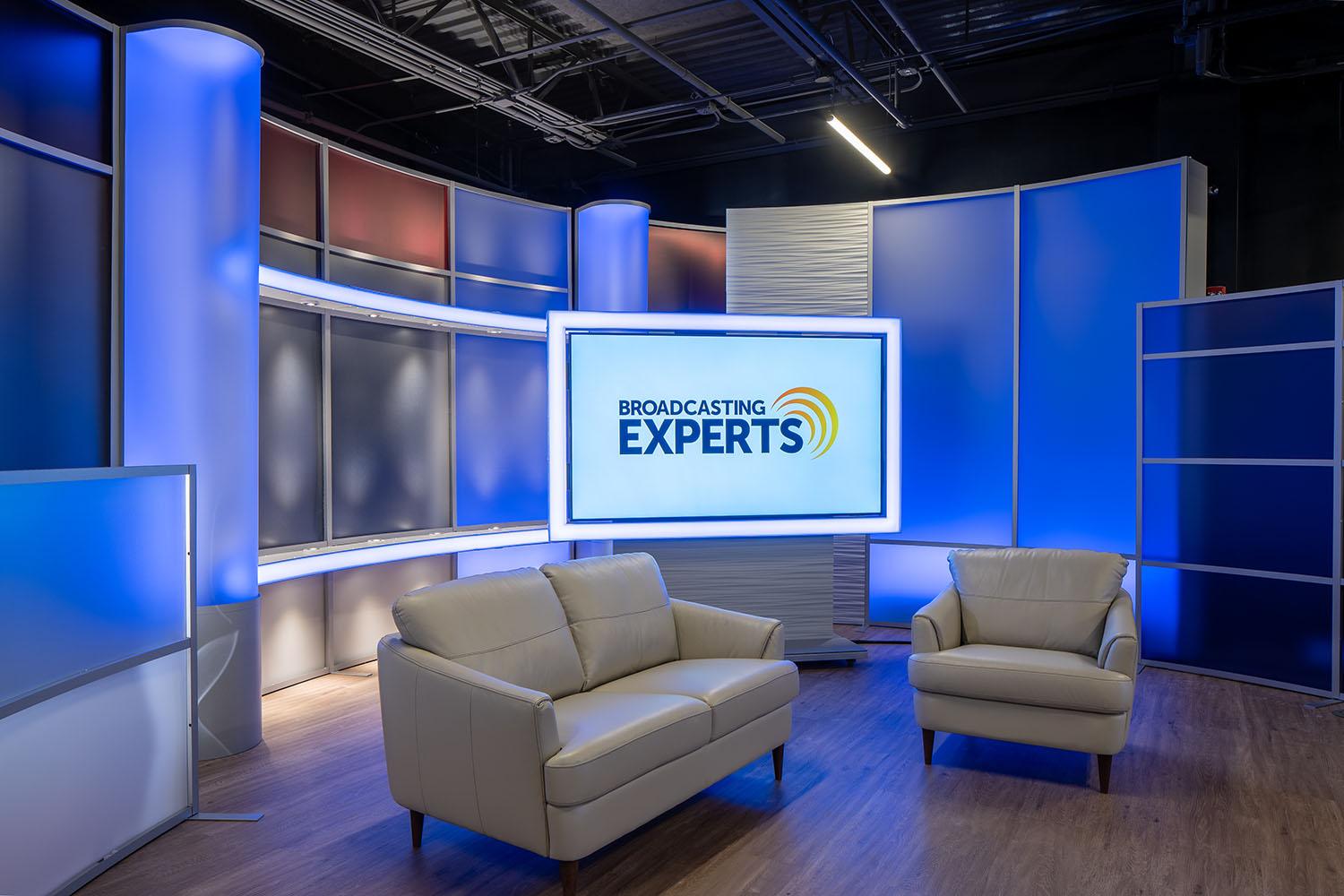
The reason so many large studios use large, slightly blurred, swirly abstract blue graphics is that they work. As long as it is done well, there is no obvious sense of scale. These graphics imply depth, do not get close to any human skin tones, and are mildly attractive. Often, studios keep branding off of the graphics, which can be wise because they can change shows or logos without having to change everything in the background.
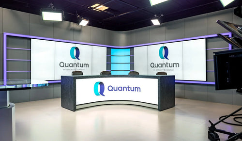
In developing a much smaller studio space, one must be careful about any graphics used. They can look huge like they’re going to swallow the speaker’s head. Lines have the potential to look like arrows going through talents’ heads. Logos and branding can look like cinder blocks of overly contrasting colors, completely distracting from the talking head. One should avoid these pitfalls.
A little bit of blur on a background graphic is not bad. Again, this implies a depth that is otherwise not present. Be careful about static branding because the high-contrast nature of it can distract from the actual program you wish people to view. Consider saving the branding for an on-screen monitor or to be applied in post production. When developing graphics, make sure to use colors that do not blend with human skin tones or prevent the use of a green screen. Keeping these things in mind enable you to make graphics that truly bring out and improve the look of your broadcast, rather than distract and confuse viewers.
Aperture
Aperture is a camera setting ignored by too many studios. A complete explanation of aperture is beyond the scope of this document, but I can tell you how it applies to studio design. High aperture takes in less light, but is very sharp everywhere in the recorded image. Low aperture takes in a great amount of light, but is blurry everywhere other than the focal point.
Most TV studios that we have worked with shoot everything at 2.8. This is a nice, safe medium that does not require enormous lights, and stays relatively sharp in general focus. If you try shooting at an aperture of 1.8 or 1.4, you will find you need less power in lighting, and that the background will be slightly blurred. The lighting advantage is obvious. The blur advantage is that it can make your studio seem larger than it really is. In photography and videography, this is referred to as depth of field, and it can be your friend. Experiment with settings and find your happy place.
Angles and Distance
In a small TV studio design, keep the talent as far from the background as possible. This helps with lighting and sound isolation, and brings out depth. Additionally, you can gain a visual advantage by not shooting dead on perpendicular flat to the background. Make sure some side walls are visible, even if it is only one. This creates perspective lines that our eyes perceive as depth.
Summary
A small TV studio design is not impossible, and can be very attractive with a little bit of planning and wise design decisions. Take your time, think through the angles. If you have the resources within reach, do some computer renderings to get an idea of your final design. It is possible to develop a small TV studio design that everyone loves, even with a tight space and budget.
Feel free to contact us about our products and services. This is exactly what we do every day.
You can develop a small TV studio design that everyone will love, even with a tight space and budget.


